Quest
Shinder Cantor Lerner LLP
Stouffer's
Vital Pursuit
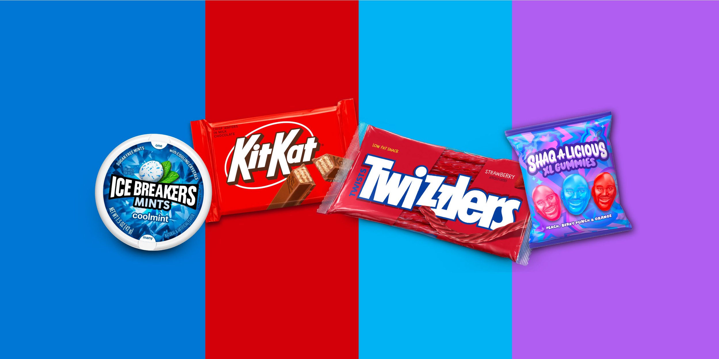
The Hershey Company
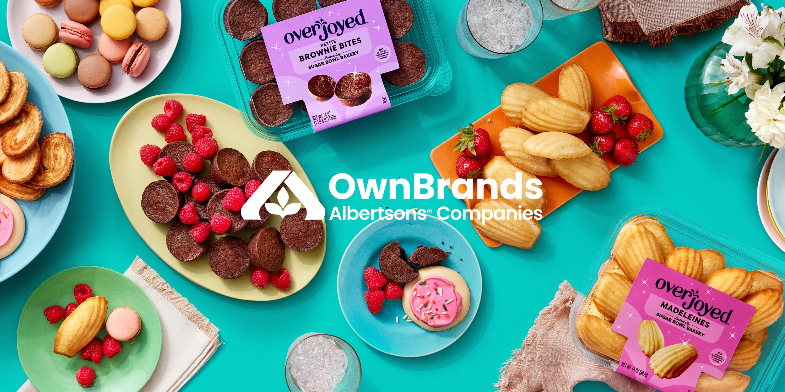
Albertsons Own Brands

Microsoft Pride
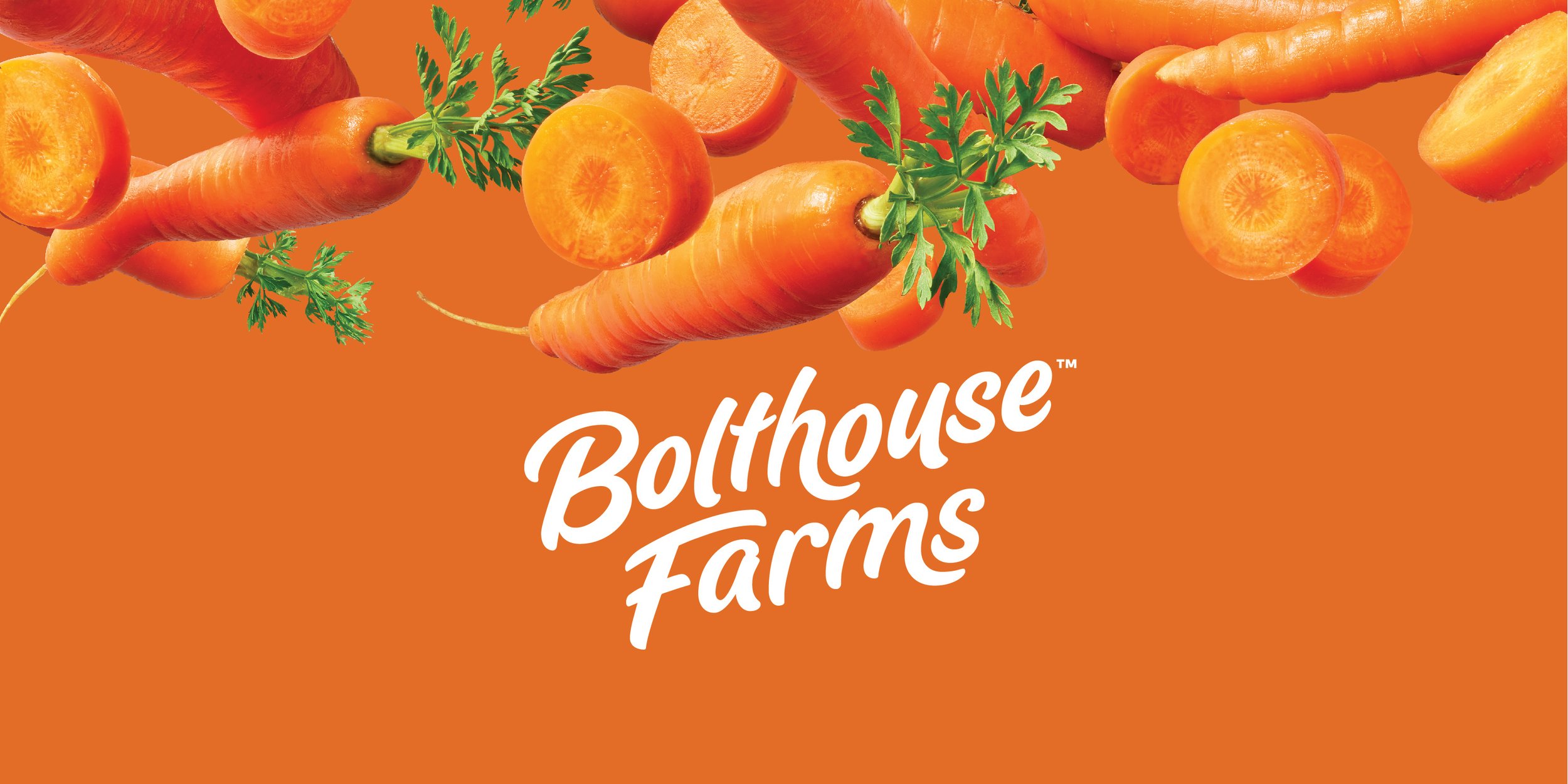
Bolthouse Farms
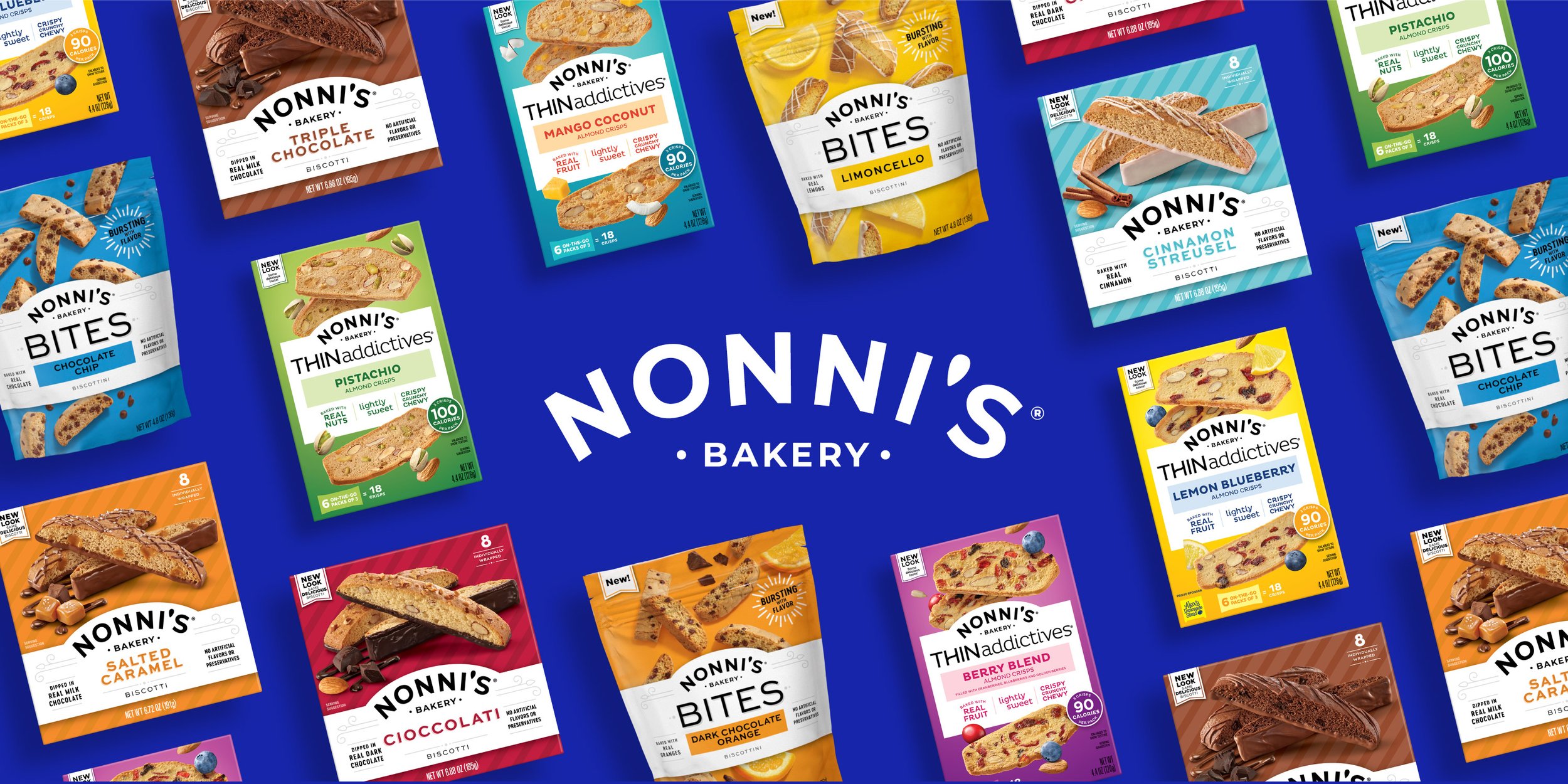
Nonni's
Coffee mate
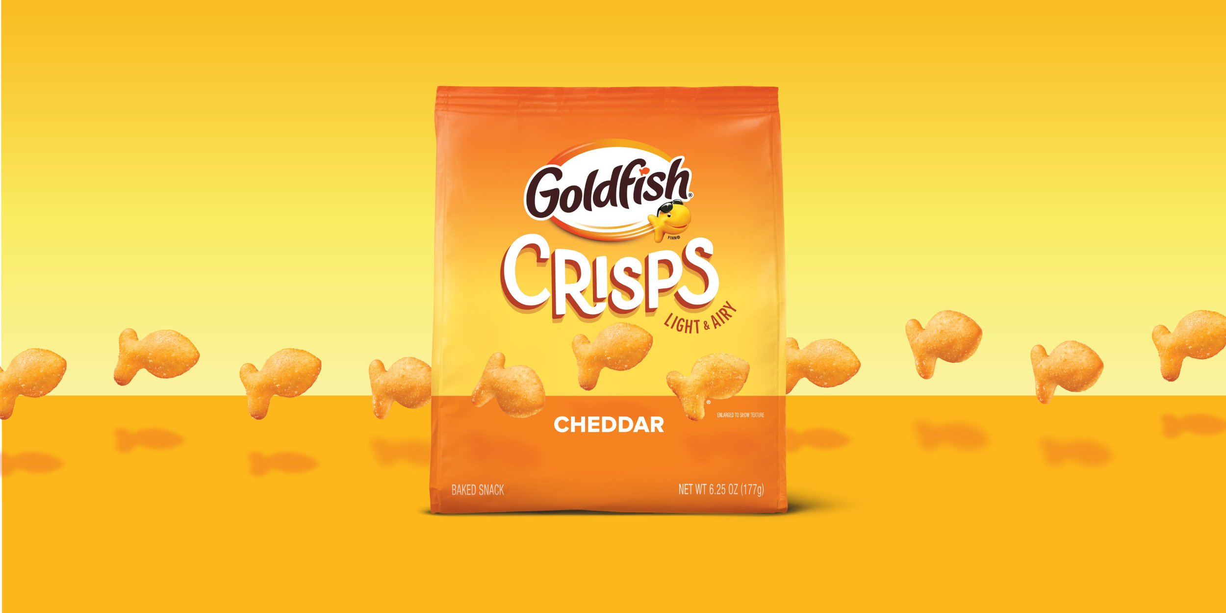
Goldfish
EarnIn
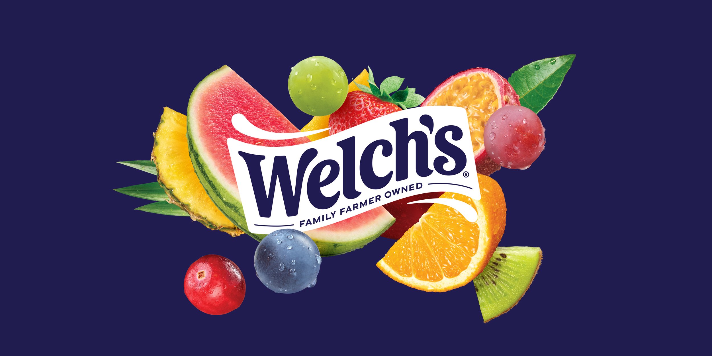
Welch's
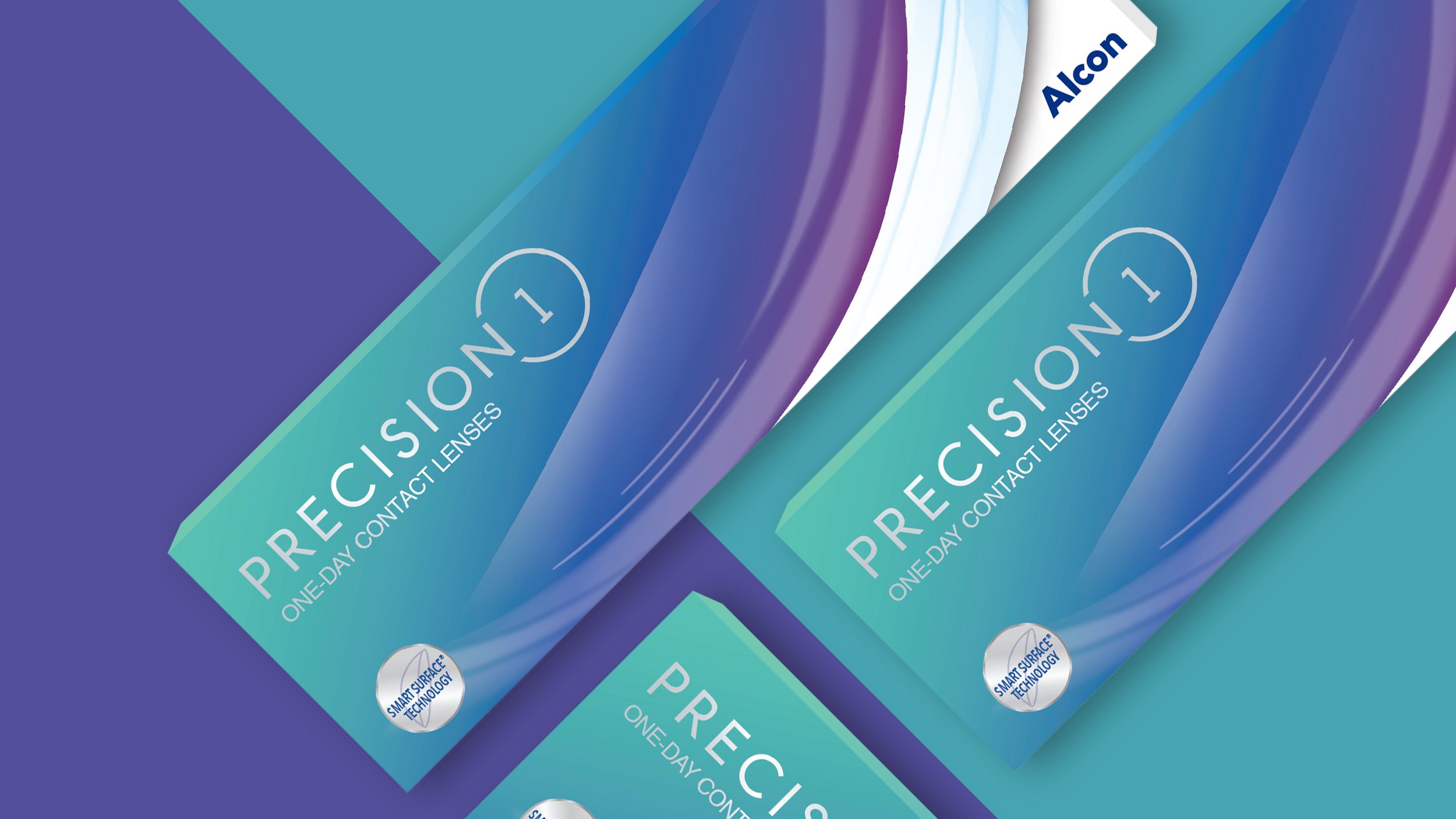
Alcon Precision
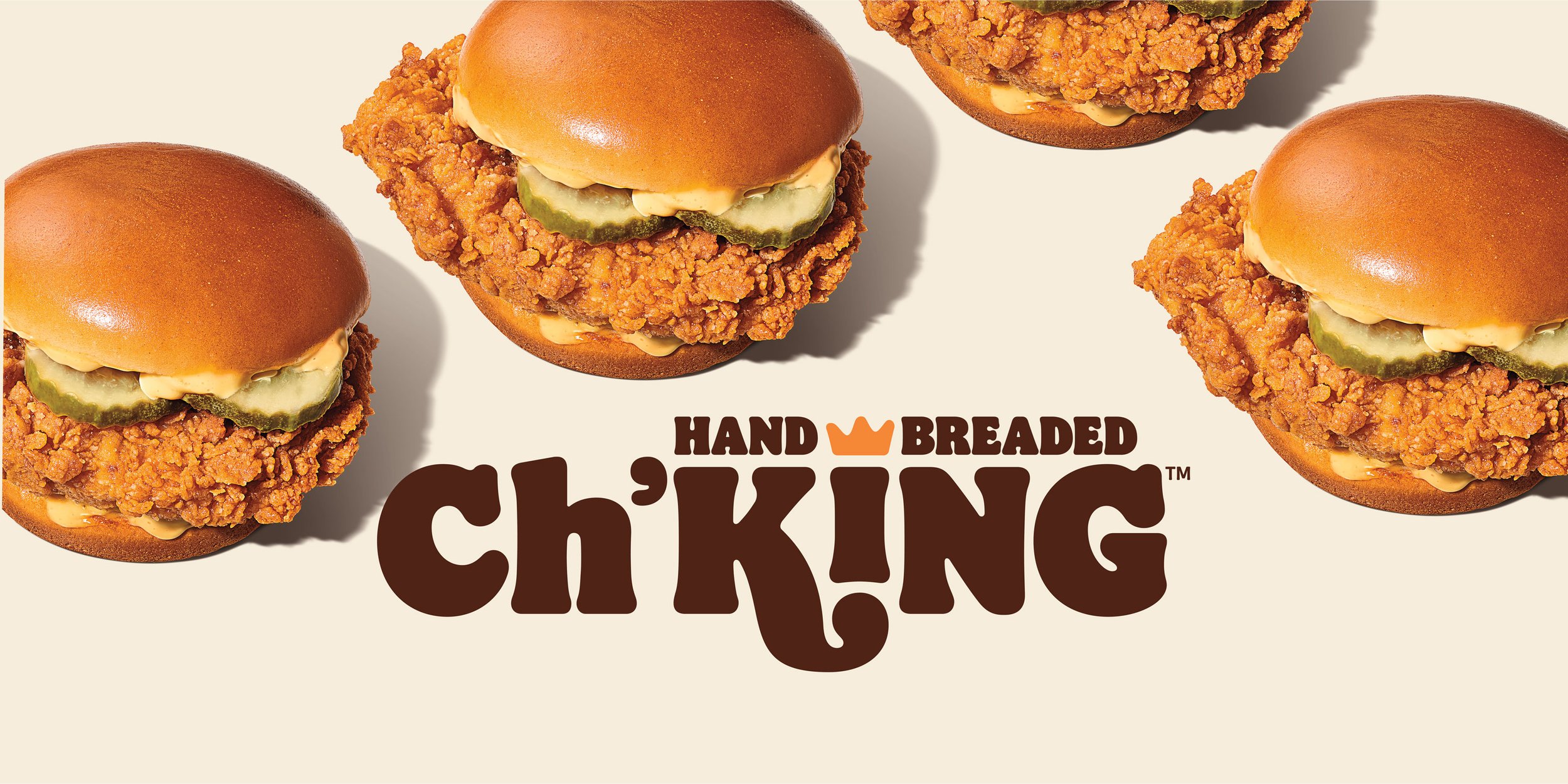
Burger King
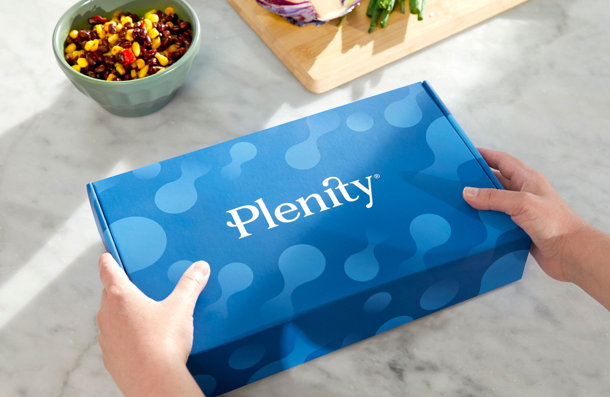
Plenity

Limelight
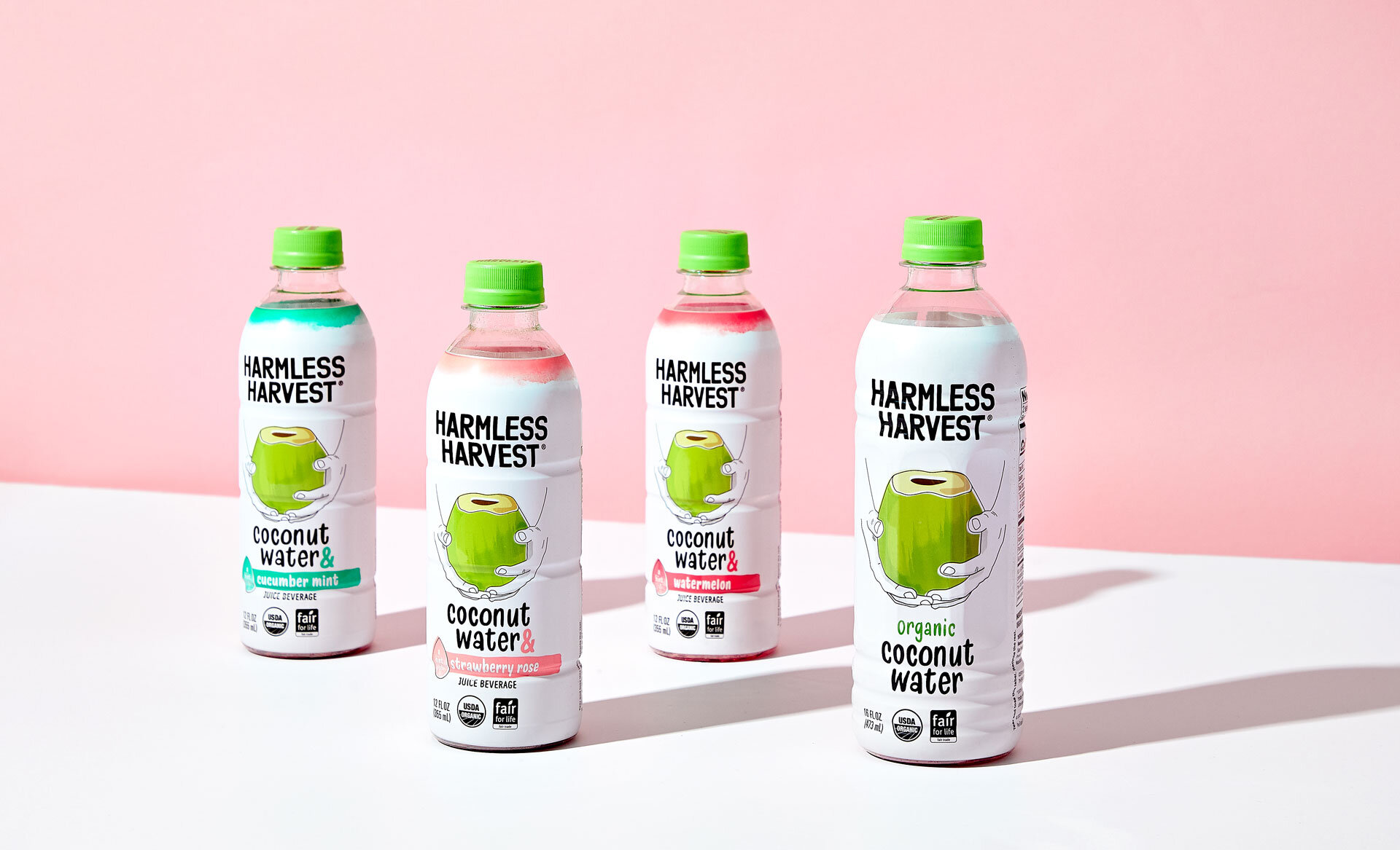
Harmless Harvest
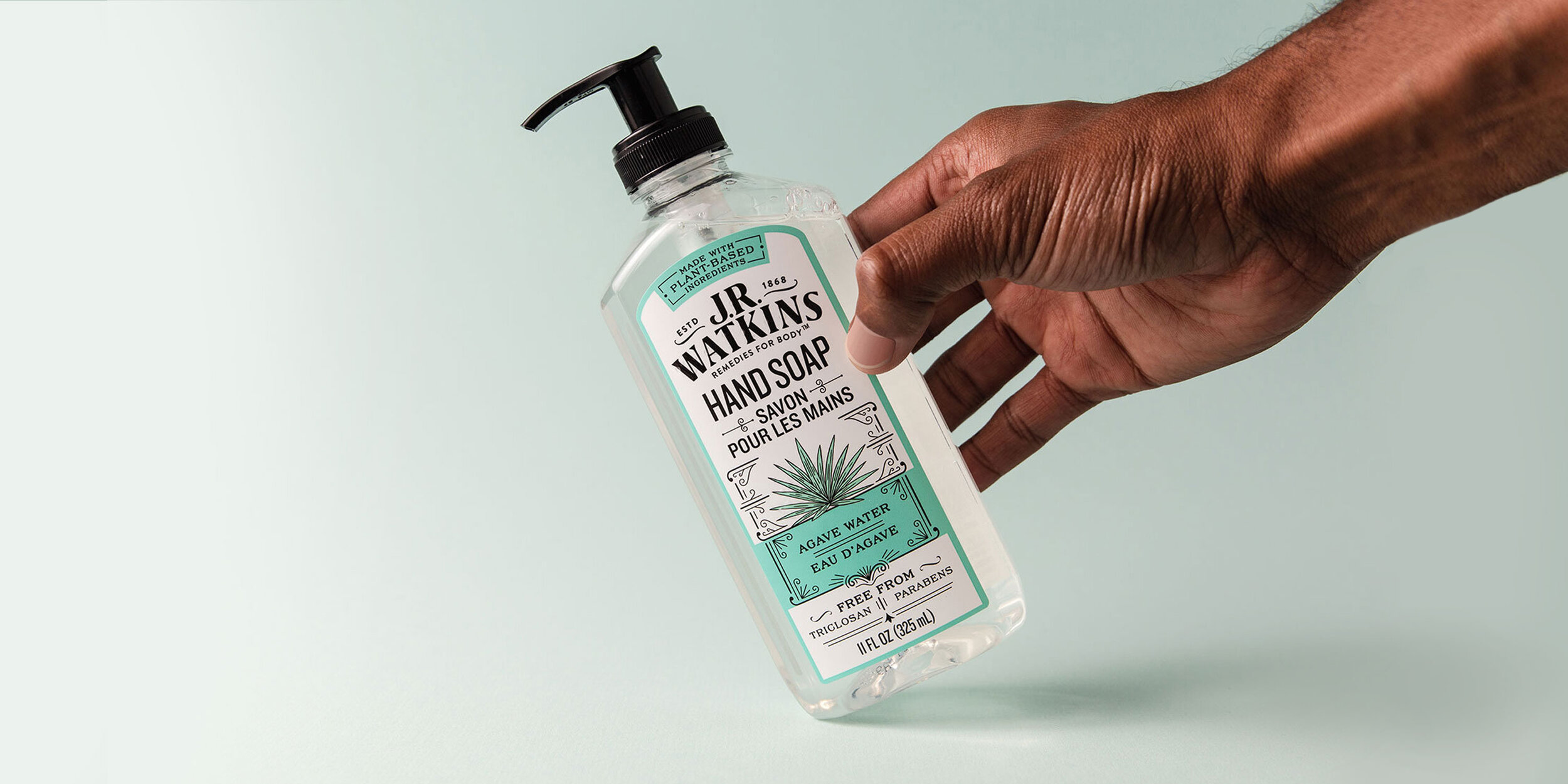
J.R. Watkins

Voortman Bakery

PlantFusion
Stoli
Corona
FC Cincinnati

SpoonfulOne
Krispy Kreme
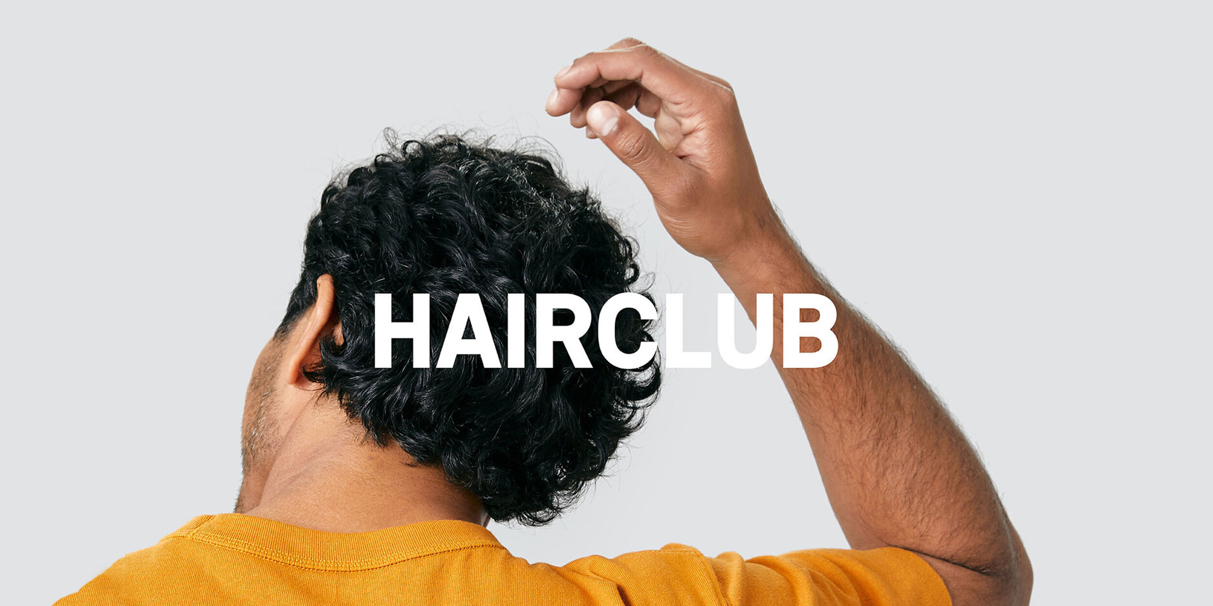
HairClub
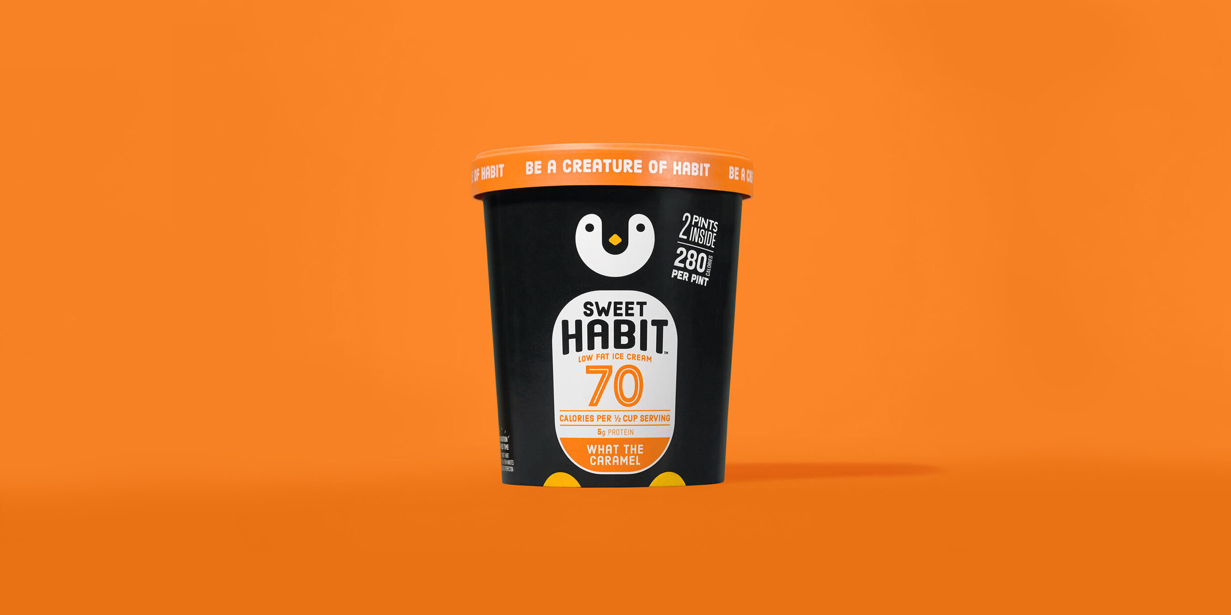
Sweet Habit

CWEA
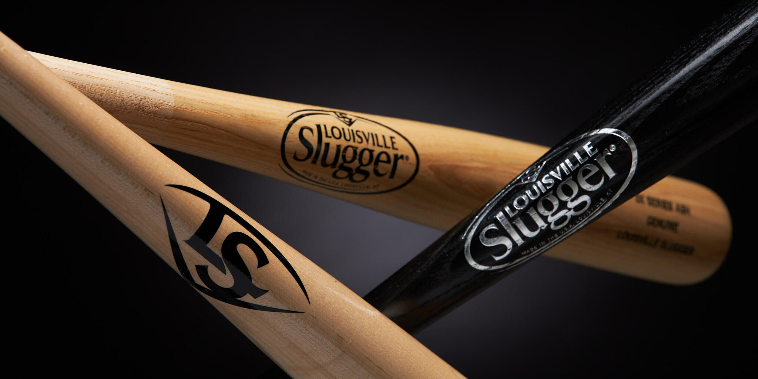
Louisville Slugger

Twizzlers